TQIntelligence: Product Design & Web Design
Creating a streamlined patient success tool for mental health workers.
Virtual Internship | Fall 2020
Background
TQIntelligence is a startup that manages an AI-powered patient organization software for therapists serving low-income areas. My main role as a design intern was to make their products more appealing to their users, as well as establish a stronger brand identity for the company.
Skills: Product Design, Style Guide creation, Web Design, Copywriting, Marketing
Time: August 2020 - December 2020
Role: Interface Designer, Web Designer
Team: Yared Alemu, Ashu Joshi, Mark Washington, Google For Startups
Tools: Figma, Squarespace
Projects
Web portal interface design - redesigning the style and user flows of the company’s patient management product
Website design - updating the company’s website to better reflect the service they provide and TQIntelligence’s mission
The challenge
How might we enable therapists serving low-income communities improve the quality of care they provide?
The solution
Enter TQIntelligence: an Atlanta-based startup that provides software that automatically flags high-risk patients using psychological assessments and Artificial Intelligence.

Web Portal Interface Design
Adapting a bare-bones prototype to a brand-aligned interface.
Context
TQIntelligence’s main product, Clarity AI, is a patient management software for mental health workers serving low-income communities. This works by therapists taking data from patients using a mobile app (survey responses and voice samples), and therapists, their supervisors, and Utilization Managers (UM’s oversee therapy agencies) view this data & relevant analytics via a web portal.
Most of my work was focused on redesigning the web portal to be more user-friendly and true to the company’s brand.
Where I started
When I started working with TQIntelligence on their product design, they had already developed a flow for Clarity AI and had conducted some user research. Thus, it was my responsibility to take this feedback and structure into account, and redesign the “look” of their product.
Process

Research
User research focus group:
Before I started my internship, a “focus group”- style feedback session with users had been conducted. I complied the notes from the focus group, put them in a spreadsheet, and prioritized them based on how much they affected the user experience.
Although much of the feedback was related to software bugs, some design-related feedback included:
Competitive analysis:
I decided to take a look at some competitors in the mental health software space (such as Mindstrong, Kintsugi, and Ginger), as well as patient-management companies such as Epic. I noticed that many of the most popular mental health programs had somewhat trendy and quirky design elements since they’re targeted for younger tech-savvy users. However, I also noticed that many strictly medical softwares had a more plain design, often incorporating shades of blue and gray for a classic medical feel.
Since our users are mainly middle-aged professionals serving lower-income communities, I decided that a mix between the fresh and professional designs while prioritizing simplicity and clarity for our older user base would be best.
Define
Pain points
There were major inconsistencies in the interface of the app; buttons were simply text with hidden links, and icons led users to pages that were unrelated to the icon
The mission, mood, and existing brand elements were completely absent from the interface
The wording in some of the included psychological surveys was unclear
Users couldn’t see patient data “overviews” to get a gauge on their patient’s mental health status
Goals
Clarify interface inconsistencies and introduce UI/UX best practices
Ensure that included surveys are readable
Present patient data in a comprehensive and digestible way
Create a simple, professional, and refreshing design system for TQI
Style guide
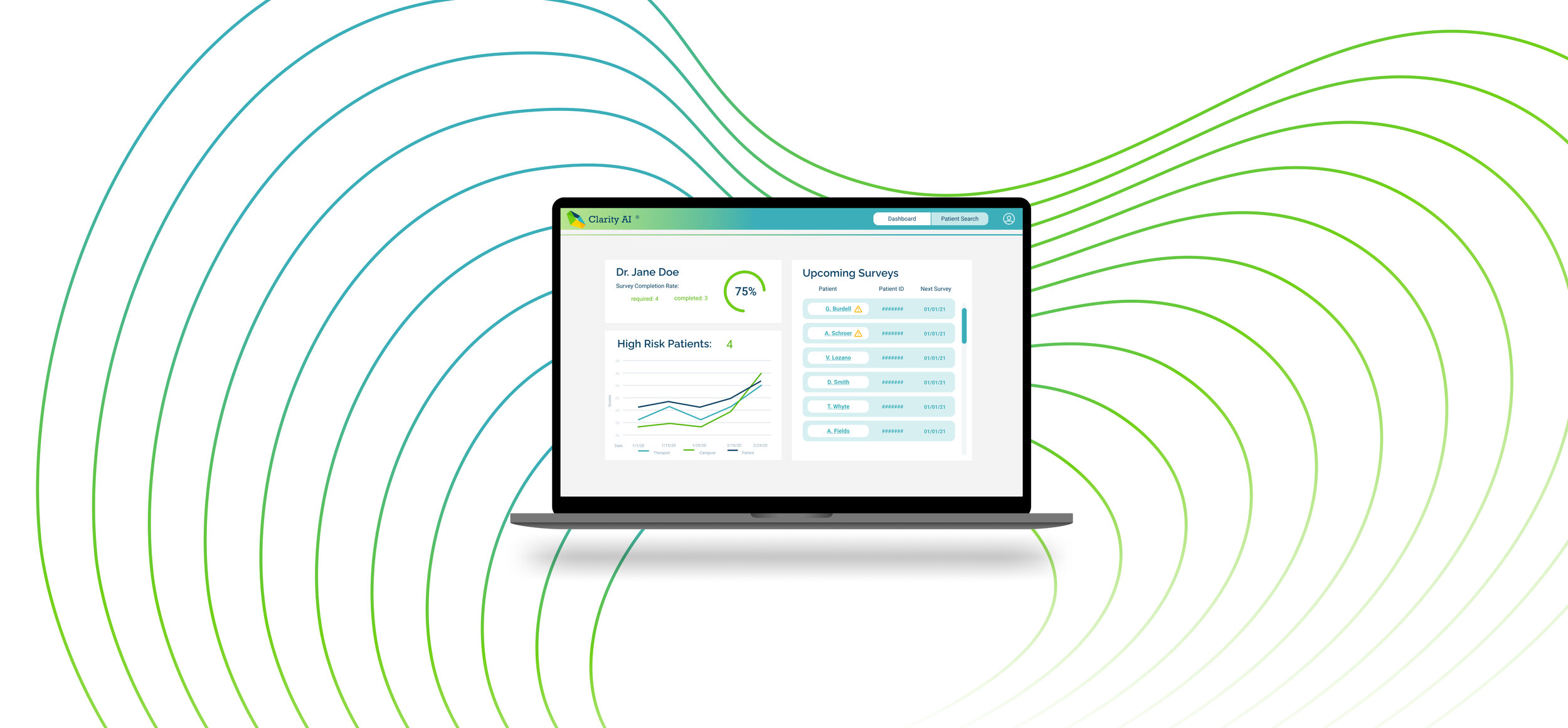
TQIntelligence already had an established logo when I joined the team; I took the colors from the logo as inspiration for the UI color palette to establish the company’s “look,” and chose fonts and designs that emulated a professional, readable, yet fresh design.
Included in this mini style guide are global color and font choices, as well as templates for repeated design elements.

Deliver

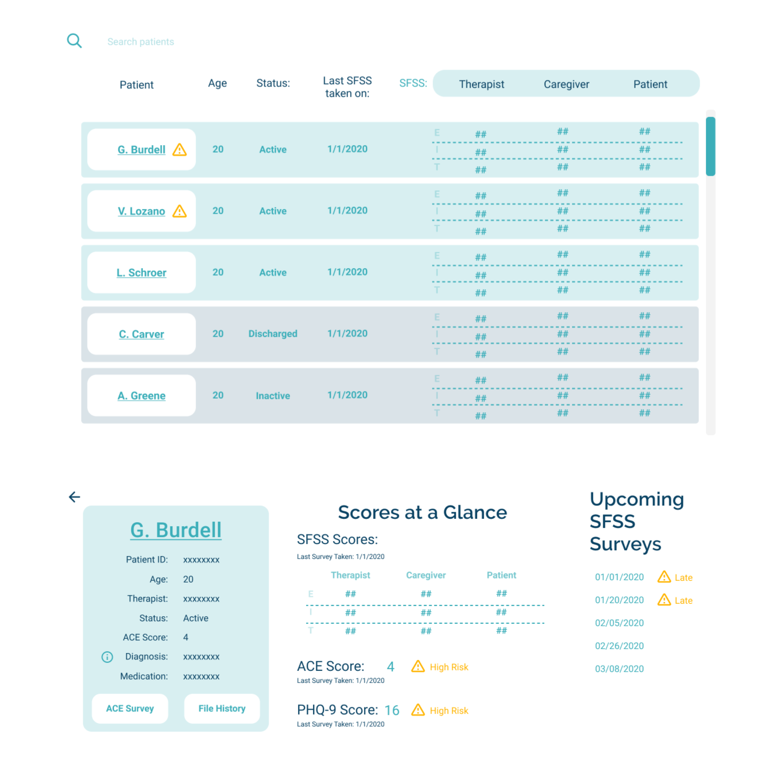
Organized patient data
I rearranged the placement of patient data on the “patient details page” by type, where the data was previously not organized; patient identification and file information is stored in the teal card, survey results are grouped together and flagged, and diagnostic data tracked over time is in its own section as well.
Streamlined ACE surveys
I changed the workflow of taking, editing, and reviewing ACE surveys to support multiple users making changes, and there is now a separate “ACE Score History” page to view changes to the ACE score. Also, since ACE surveys are only likely to slightly change over time, I made it such that the editor only alters the current responses, rather than re-taking the ACE survey from scratch, thus saving the user time and potentially inaccurate responses.
Additionally, I ensured that the ACE question formatting reflected the structure and meaning of the questions. Previously the questions had been displayed on one line, resulting in confusion and perceived grammatical mistakes.


Easy searching
I changed the formatting of the search result items to be rows, rather than blocks or columns. This focuses the search result names to one area of the screen, allowing the user to easily parse through names.
I also introduced a color-coding and sorting system, where active patients are shown in light blue and pushed to the top for easy access!
Communicating with color
Yellow: I chose the yellow from the logo to act as the overarching alert/”needs attention” shade for text; the yellow provides a nice warm contrast to the cooler UI color palette, while also sticking to the brand’s color elements!
Light Teal: The light teal color was drawn from a desaturated version of the logo’s teal color; this light teal shade paired with blue text and white buttons throughout the interface design symbolize a “person” and their corresponding data, as shown in the patient detail card (G. Burdell with data and the “ACE Survey” and “File History” buttons) and in search results.
Video demo
Here’s a quick Figma prototype recording of clicking through the “therapist” web portal!
Testing & feedback
Since my designs were fully implemented in the last weeks of my internship, my user testing was limited to testing the product “dog-food” style. This testing and feedback iteration process with the team generally consisted of me recording bugs or room for improvement in a spreadsheet, meeting with the founder and CTO for discussion, and changes being made by the development team.
If I had more time, I would have loved to test my designs on our users by:
If I had more time, I would…
Observe the users walk through the product and complete main user journeys
Conduct interviews with users before and after them trying the product
Test the product on therapists, managers, and other major stakeholders, that see patients in a variety of settings
Website design
Background:
When I began working on a new website for TQIntelligence , they already had a website in place; however, it didn’t seem to be focused or act as a real marketing tool. Instead, it mainly described the psychological effects of stress, the research behind their patented AI technology, and detailed team biographies.
I knew that we could do better, and that having a streamlined website with relevant, well-communicated information would be an invaluable asset to the startup. I had the opportunity to collaborate with a creative director at google and receive her feedback and advice on how to structure the site.
The process:

Goals:
In redesigning the website, the we agreed that the main purpose of the website should be to really showcase and describe the product in order to attract potential investors and clients.
Thus, here were the main checkpoints to make that goal happen:
describe why the product is important and useful
describe the product’s features, capabilities, and structure
address questions and concerns proactively:
Why do I need this/how can this help?
Is it secure?
How does this improve the workflow?
Who is this for?
generate empathy for the mission-driven intentions of the startup
build credibility and professionalism for the startup
Additionally, I wanted to match the site’s style to the web portal style guide for brand consistency.
Drafts:
After clarifying the website goals, I made some drafts brainstorming the site structure!
Check out some of my scratch work here:

1st draft home page: starting with the mission and features

1st draft home page: starting with the mission and features

2nd draft home page: starting with the flow and the benefits (WHY should someone invest in this product?), and building credibility

2nd draft home page: starting with the flow and the benefits (WHY should someone invest in this product?), and building credibility

2nd draft home page: starting with the flow and the benefits (WHY should someone invest in this product?), and building credibility
Final Design

Start with the “why”
The site hero at the top of the home page clearly addresses key components of the product:
Who is the product for?
How does it work?
Is it legit?
How does this help?
I also included a call-to-action of reaching out and asking for a demo (at this time there is no automated sign-on process; investors must reach out to the company personally in order to get started).

It’s all about the product
The “Features” page of the website delivers an “elevator pitch” of all the product highlights and abilities, while also emphasizing how these features can directly improve your mental health practice’s workflow and quality of care. This helps the site visitor better understand not only the how, but the why of Clarity AI.

Highlight the mission
Since the startup was truly started with the intention of improving the lives of people in need, I wanted to showcase the mission and story of the company as a “pathos” persuasion element throughout the website. The urgency and importance of this work is featured in the home page as well as the “our story” page.
Reflection:
Overall, I had a great time working with TQIntelligence! I’m grateful for the opportunity to really take ownership and initiative on my designs, and I hope to see my work used and improved upon by designers and interns in the future. I also really loved becoming more familiar with different design tools; I feel like I gained a lot of mastery in Figma, Adobe Fresco, Procreate, and Squarespace!
Here are some additional takeaways and lessons:
Material design is a thing, and is a great place to look for UI inspiration if feeling stuck!
Feedback can (and should!) be structured and organized - it’s so much easier to keep everyone on the same page, clarify action items, and get things done if feedback is given in a structured manner in writing
Testing the product yourself on multiple devices and browsers, is really important! You never know what’ll look different browser to browser…
If I had more time, I would…
Conduct analytics on the website to see what improvements and optimizations can be made
Do follow-up user research & iterate further on my designs
Redesign the mobile app measurement tool to match the new web portal’s style guide