
Trenchr
A streamlined campus room reservation service created for the Google Interview Process.
Interview Design Challenge | Spring 2021
Time: 15 hours
Role: UI Designer, UX Researcher
Team: Just me! (and my lovely interviewees)
Tools:
Figma
Google Forms
Procreate
Skills:
UI design
UX research
Prototyping
Mapping
Material design
Background
As part of the Google UI/UX Design internship selection process, I was tasked with designing a room reservation experience for my college campus, including the experiences of:
checking availability
reserving a space
reporting any issues
Although I’m familiar with Georgia Tech’s current room reservation system, I knew that the room booking experience could be transformed to delight campus.
Process
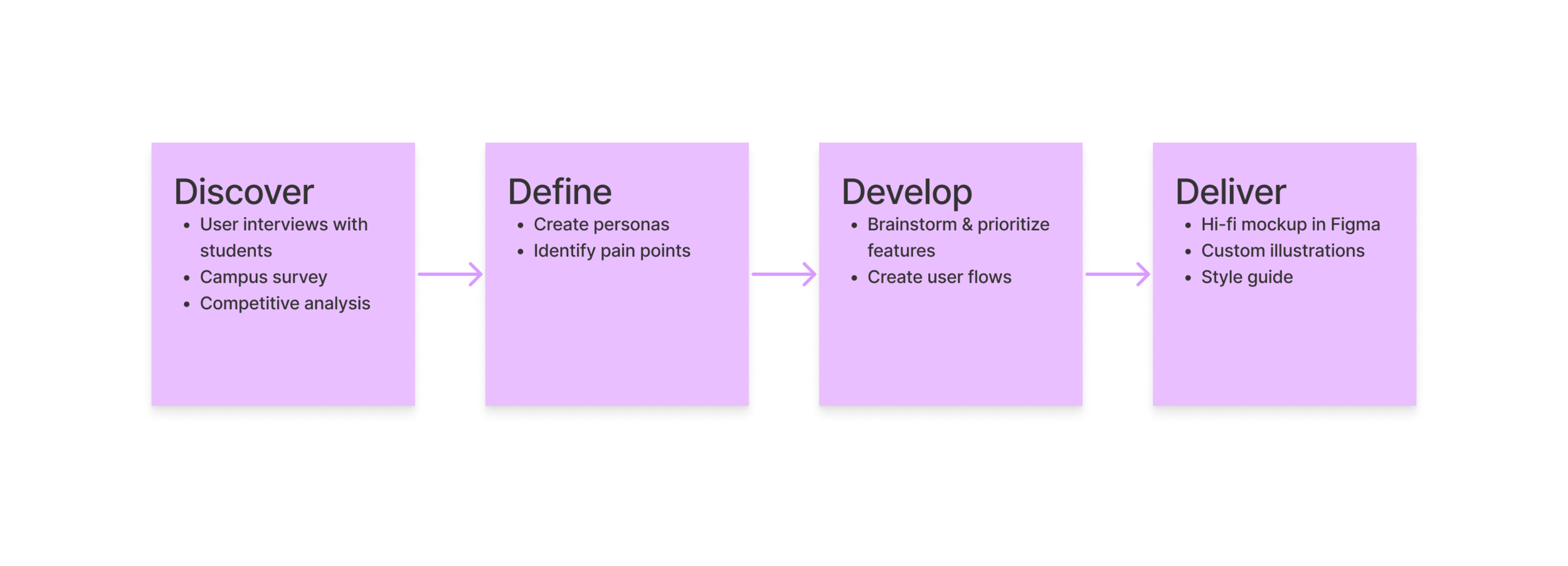
Discover
To dive headfirst into the problem space, I conducted 6 user research interviews and gathered 64 survey responses regarding Georgia Tech’s room reservation system.

Define
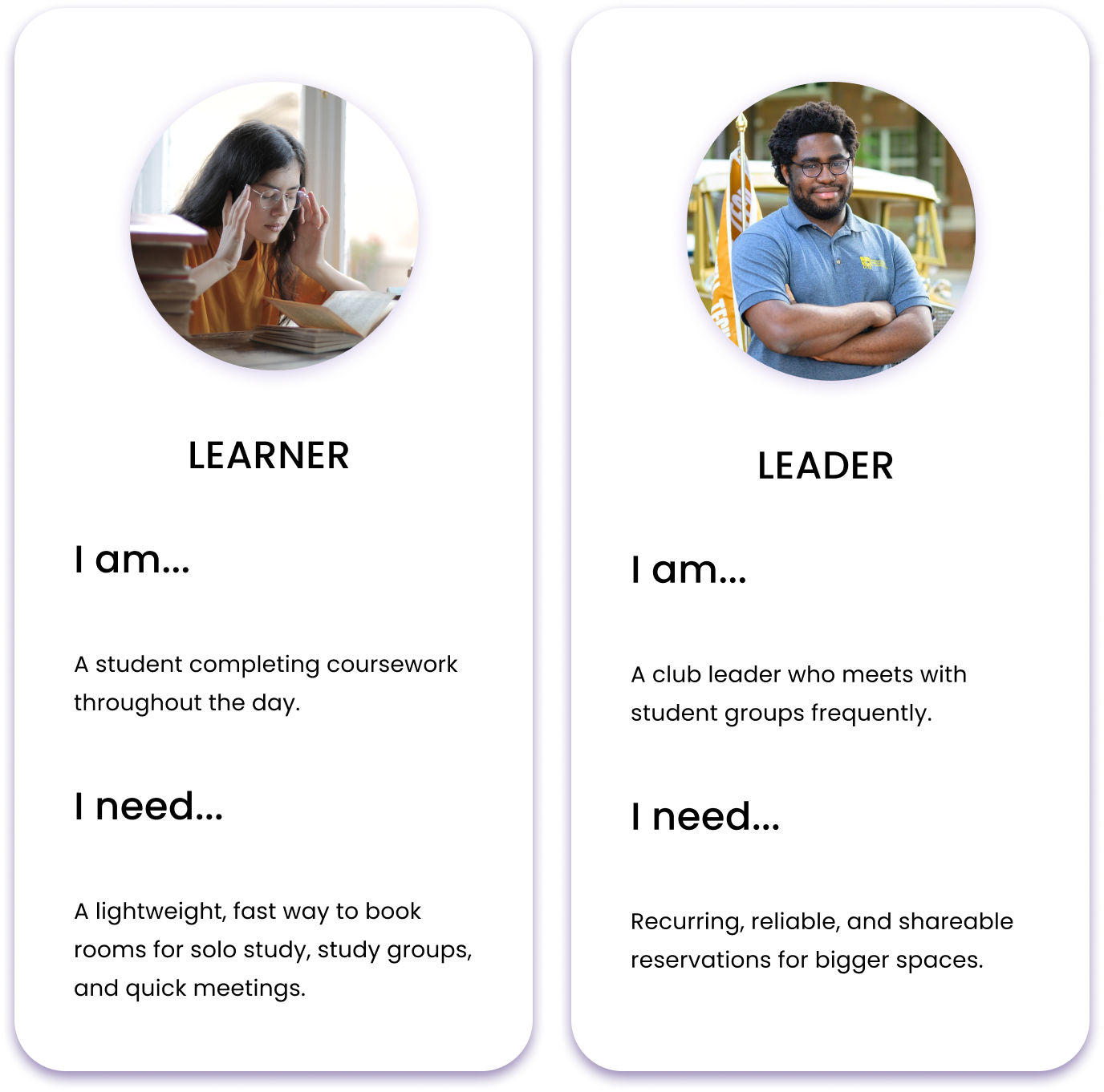
To further understand the problem space, I compiled the user interview and survey data to generate 2 user personas and identify major pain points for students reserving rooms on campus.
Key pain points:
The current interface is perceived as confusing and is unreliable.
Students can’t easily enter empty classrooms or unreserved breakout rooms for study, wasting valuable space.
Campus leaders can’t share their reservations with their teams, leading to logistical issues.
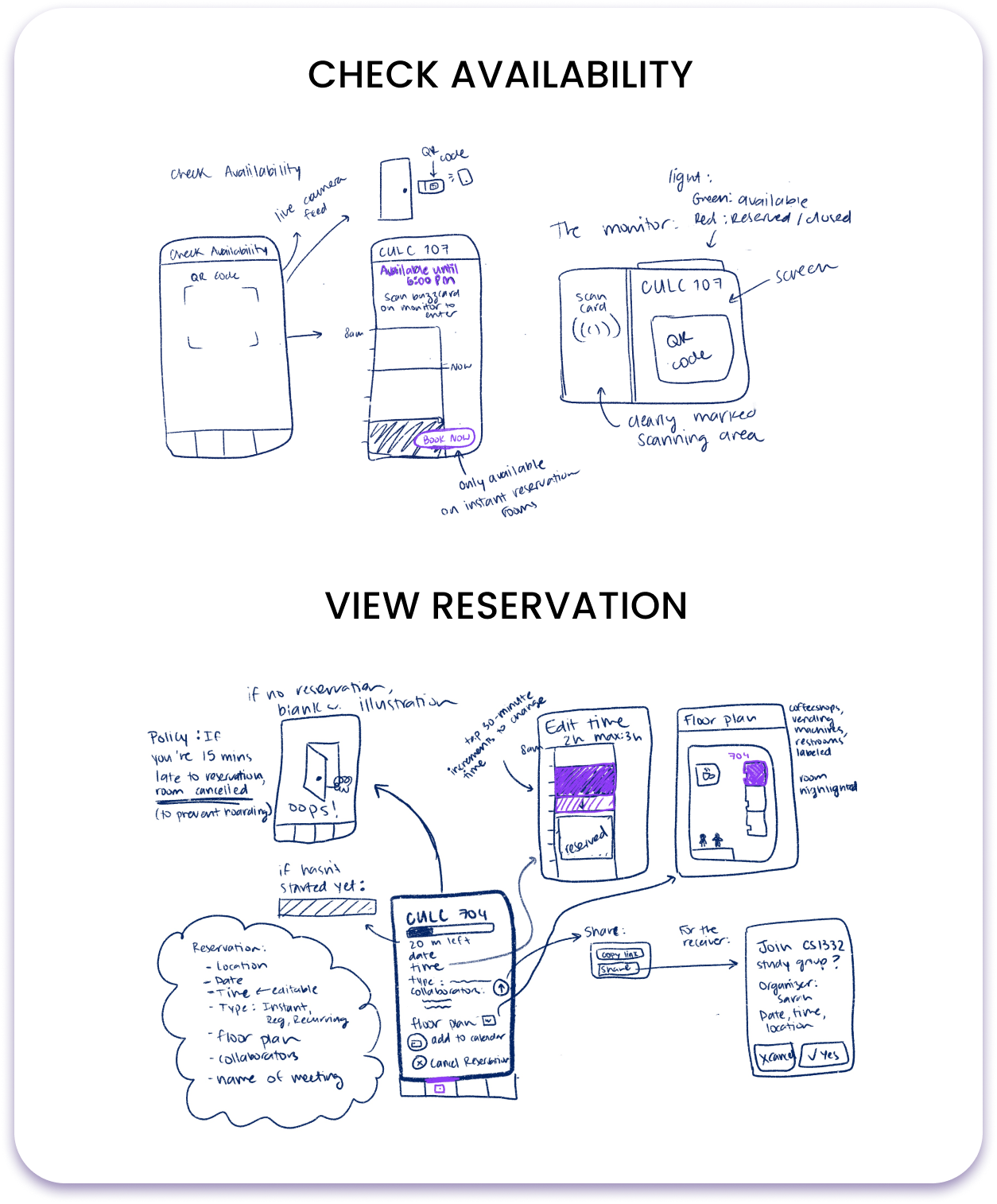
Develop
To organize my thoughts and keep user goals in mind, I first brainstormed and sketched the concepts for the new experience on Procreate.
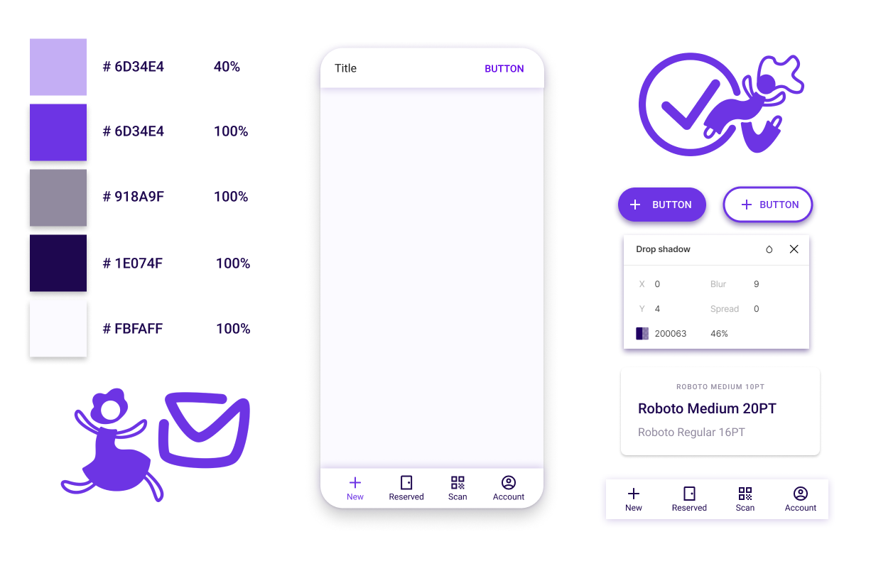
Style Guide
Although blue is often the choice for study-related interfaces, many applications that students use already have a blue color scheme (bluejeans, groupme, outlook, google docs, linkedIn).
Purple maintains an air of coolness and focus, while still standing out from the crowd!
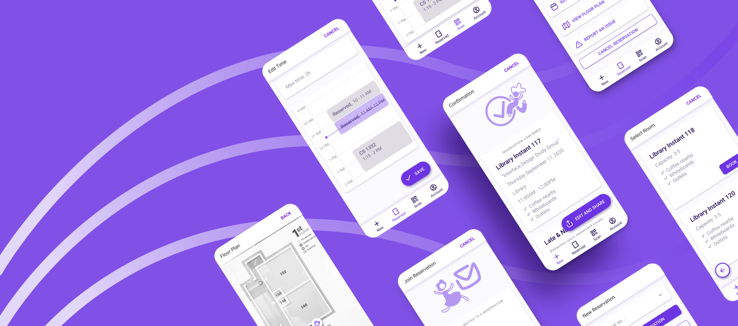
Deliver

A streamlined solution for the student lifestyle
This design prioritizes a clear, step-by-step booking process for students looking to make a quick reservation.
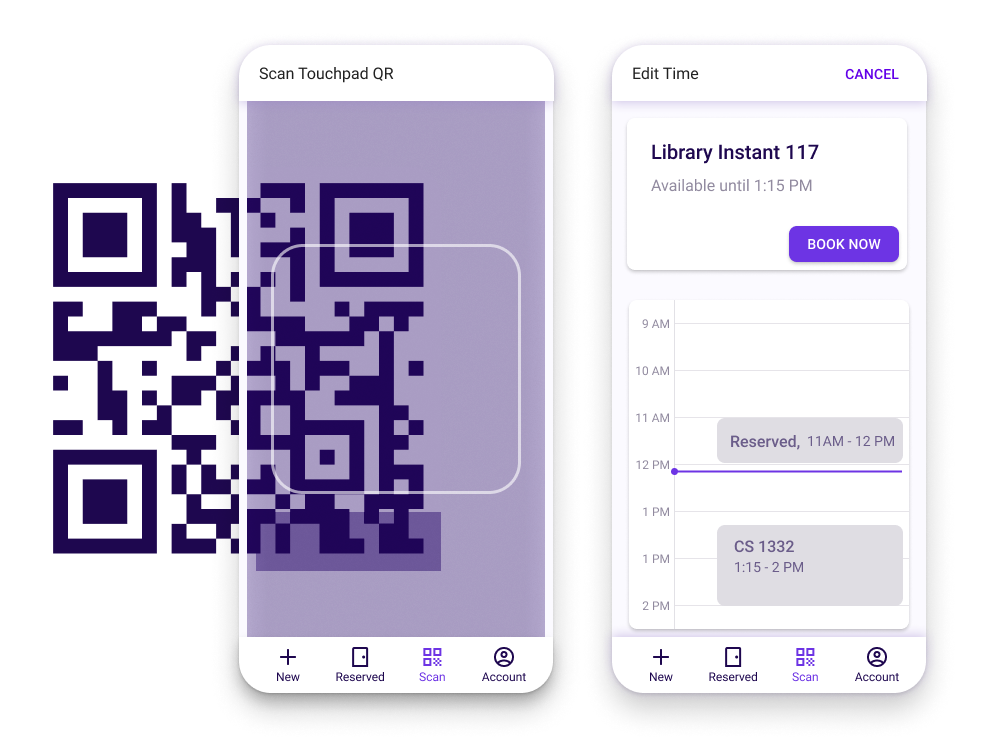
Making the most of available space
Including a scannable QR code outside rooms allows students to quickly book empty rooms on-demand, on-site.
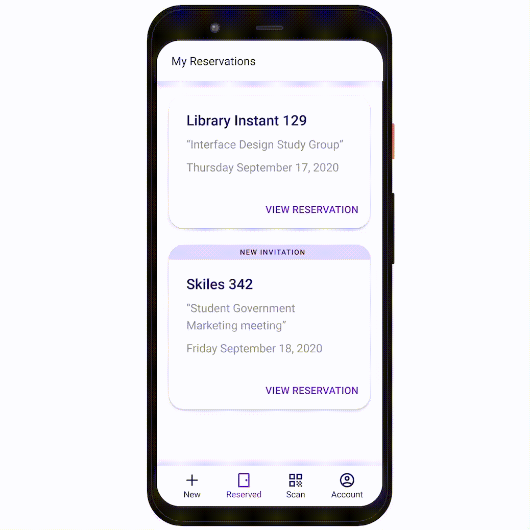
Collaboration is key
Allowing students to share reservation details and room access keeps campus leaders and collaborators in mind.
I learned…
Monochrome color schemes are a great way to keep things cohesive and simple.
Speaking to users 1:1 is invaluable; they have the greatest ideas!
Sometimes it’s ok to solve the biggest problem at hand, rather than all of the problems
If I had more time, I would…
Conduct user testing to compare user satisfaction with Georgia Tech’s current system to my new design
Explore the perspectives of other key stakeholders (campus space managers, facilities, upper level administrators, finance offices, etc.) to gather a more holistic view of the problem space
Hungry for more?
Check out my full design process in the original write-up