

PathPrep
An accessibility-focused navigation app for low/no-vision explorers.
Class Project | Spring 2021
Background
Navigation is a whole different ball game for those who lost their vision, and the options for a quality wayfinding experience with visual impairments in mind are slim.
That’s why in my Human Factors class, we tackled this issue as a class project in order to develop a solution, as well as gain a greater understanding of the needs of disabled people. I helped complete this project over the course of the semester with 3 other design students in my class, taking on the role as the UI designer and creating all the final screens for the project.
Time: 3 weeks
Role: UI Designer
Team: 4 Industrial Design students and 2 low-vision volunteers
Tools:
Figma
Google Forms
Procreate
Skills:
Accessibility-focused design
Prototyping
UX research
Mobile Design
The problem
For a blind or low-vision person, traveling to a new place is often a difficult and time-consuming process, especially for those who lost their vision later in life.
However, companies often think of accessibility for compliance, not actual inclusion, and there are few effective solutions that are tailored specifically for those with low or no vision. Additionally, many low-vision users are able to see quite a bit! They just need to enlarge the text on their mobile devices or use a magnifying glass. Unfortunately, many apps tailored for low-vision and blind users ignore this fact, and don’t invest in designing a UI that works for people with low-vision.
With the help of user interviews and background research, we decided to design a solution to help disabled people explore the world!
Process
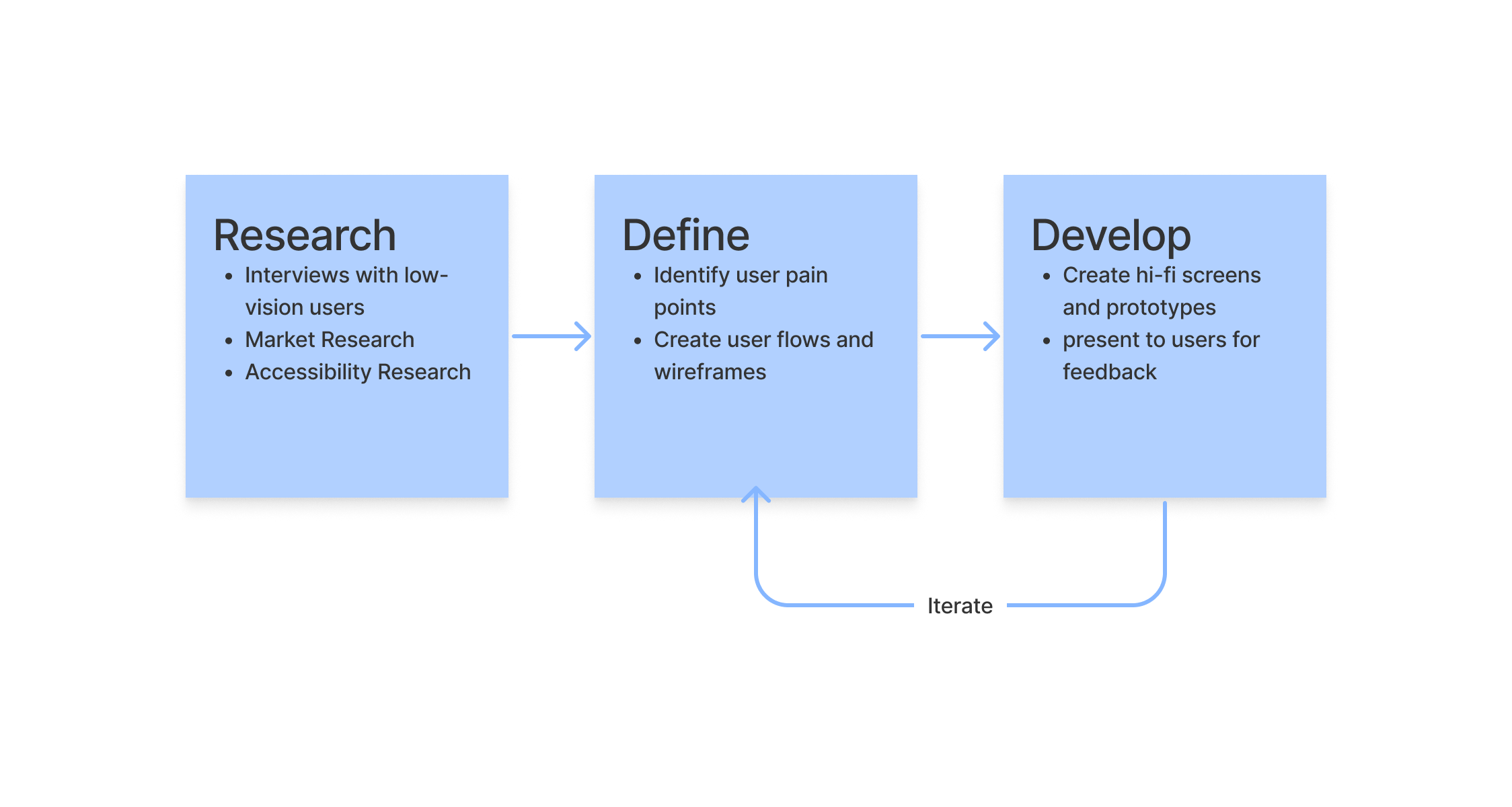
Research
User Interviews
Luckily, two low-vision members of the Georgia Tech community were available for interviews. Here’s what we gathered from our class session with them:
Those who lose their vision later in life have a harder time finding their way than those who were born with low or no vision
Visually impaired people prefer to use public transportation with minimal changes/line switches
Many low & no-vision users like to take note of things like bumpy/narrow sidewalks, construction areas, how to enter a public transport station, etc. while traveling places
Market Research
We also conducted some research on what solutions are out there already. Here are the apps we looked into, and notable features of each:
Microsoft soundscape - uses 3D spatial audio to give cues to the user about their surroundings
Google maps - the “accessibility” mode of Google maps is similar to regular maps, except users will hear more frequent and detailed audio announcements
AriadneGPS - an interactive map that aids in positional awareness through audio and touch, and is compatible with VoiceOver
Accessibility Research
Some critical accessibility guidelines we took note of are:
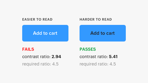
Normal text must have a contrast ratio of 4.5:1, and large text a contrast ratio of 3:1
A majority of in app information should be represented textually, as users may have issues with image and video content
Color intensity should be used to show meaning rather than different colors, as colors can be difficult for users with colorblindness to perceive
Define
Pain points
After concluding our research, we discovered that visually impaired people experience the following pain points with current solutions:
Many apps didn’t warn their users of upcoming turns or changes in direction ahead of time
The maps in some applications weren’t up-to-date
Some apps are only available for pay on the Apple App Store, disadvantaging those with disabilities
The interface design of many apps weren’t up-to-date or polished
Features
When compiling our research, our team agreed to include the following features to best serve our user group:
Be compatible with VoiceOver and built-in system accessibility features
Follow accessibility guidelines to support a variety of visually impaired users (blind, low-vision, colorblind)
Use map information from up-to-date databases
Include a note-taking feature
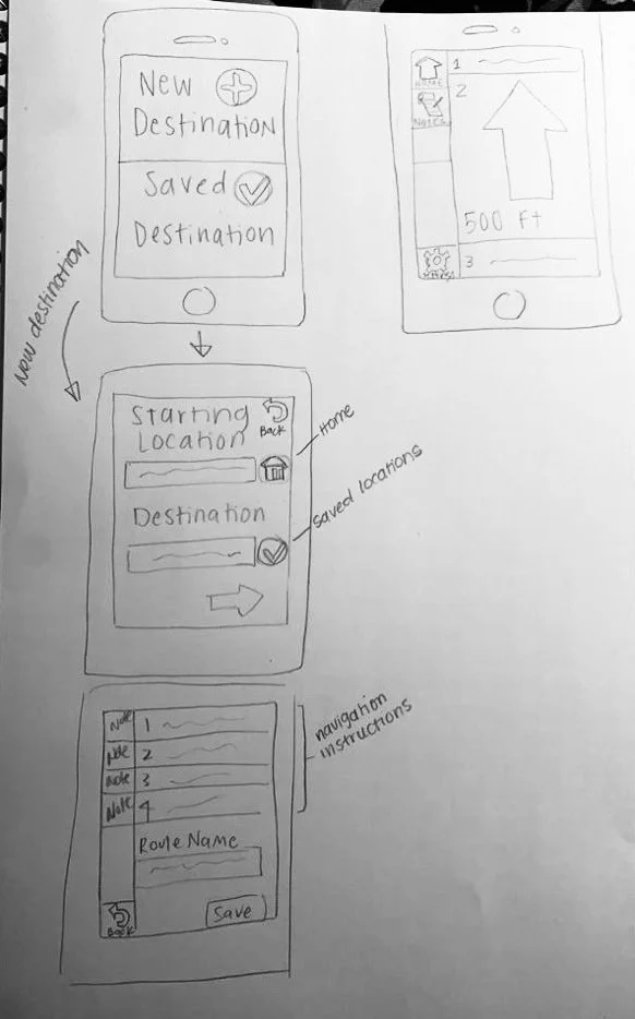
Lo-fi sketch by teammate Emely Castro
Style Guide

Deliver
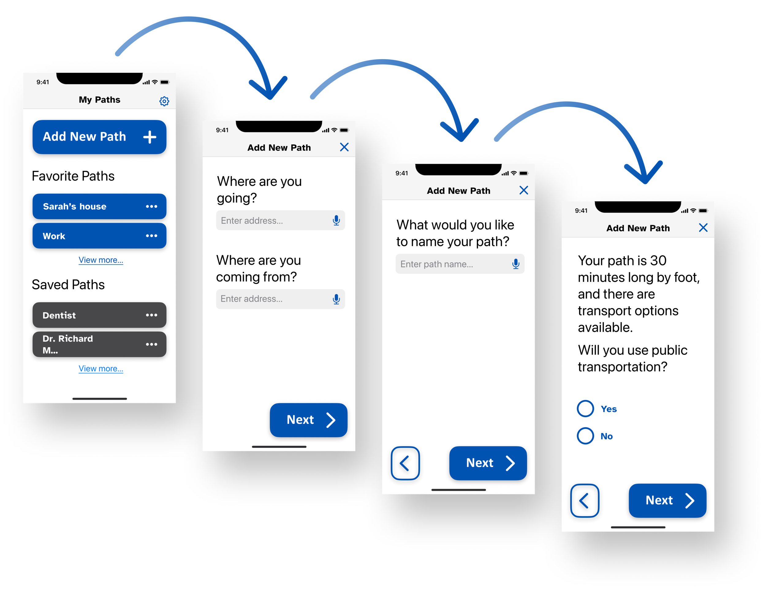
Separated into steps
The user flow is optimized for screen readers to reduce “scrolling” and an excess of buttons on one page
By breaking down the steps into smaller chunks, the task of entering information is simplified.
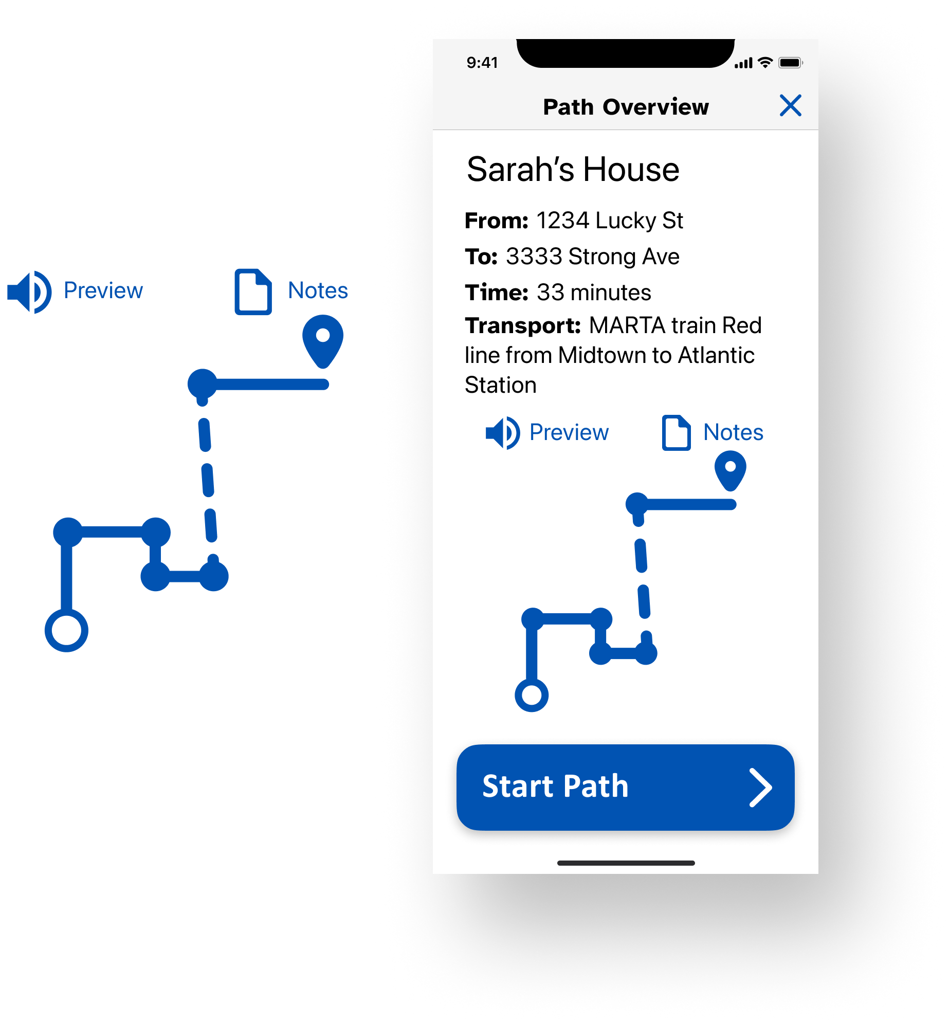
Visual context
A high-contrast simplified representation of route provides spatial awareness for users who lost vision later in life
By simplifying the path into a digestible visual, the information cost for the user is minimized
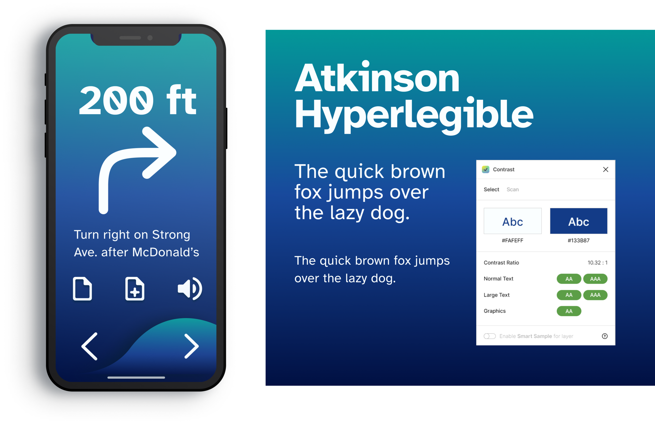
Readable & clear directions
Large arrows and distance in increments are presented on the screen for ease of use to accompany the audio instructions
Using high-contrast colors, large arrows, and extra-large text provides low-vision users with additional & accessible context
The addition of public transport options provides options to the user, and gives them flexibility and the option to make an informed decision on for the path they choose
Ideas for iteration
I iterated on my previous UI design a bit to experiment with a more sleek, yet accessible look to delight low-vision users with a quality experience. My concept for a new design includes:
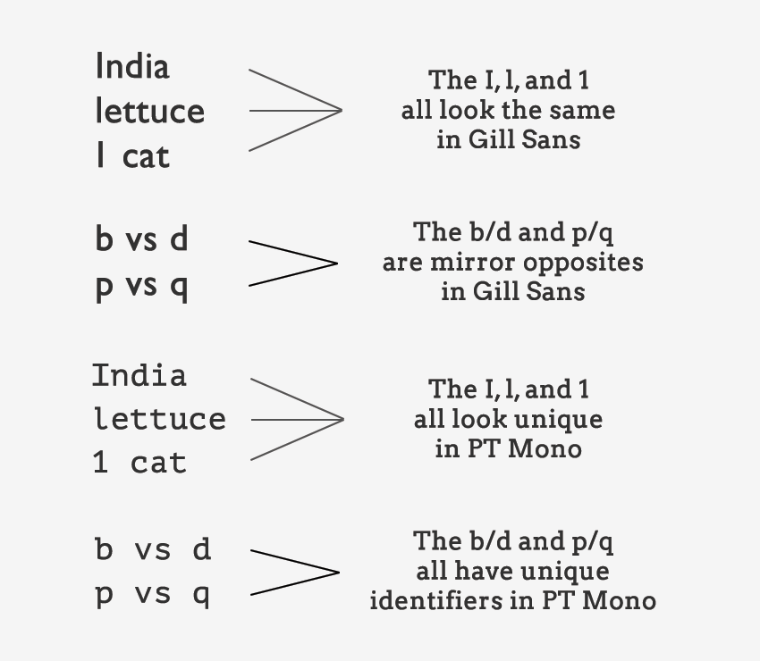
Incorporating the font Atkinson Hyperlegible, an uber-accessible font where each character is distinct and more easily differentiated than other specialty fonts
Some subtle, smooth gradients that don’t detract from a colorblind user’s experience, but enhance the low-vision user experience
Rounded, consistent, and extra-large icons for a cohesive feel and enhanced legibility
I learned…
Some may assume that the interface design for a blind user isn’t as important because they can’t see it - I learned that the opposite is true!
Many disabled people have a passion for travel and exploration, it may just take them a bit more effort to reach their destination
If I had more time, I would…
Continue to experiment & develop the updated design of the app
Do more research regarding button spacing, font hierarchy sizing, and system compatibility to cover all the accessibility bases!
Conduct user interviews with completely blind, low-vision, and color blind users to gain a broader perspective on the problem space
Hungry for more?
Check out the full presentation deck for this project